Style Workshop Week 4: Edit Down
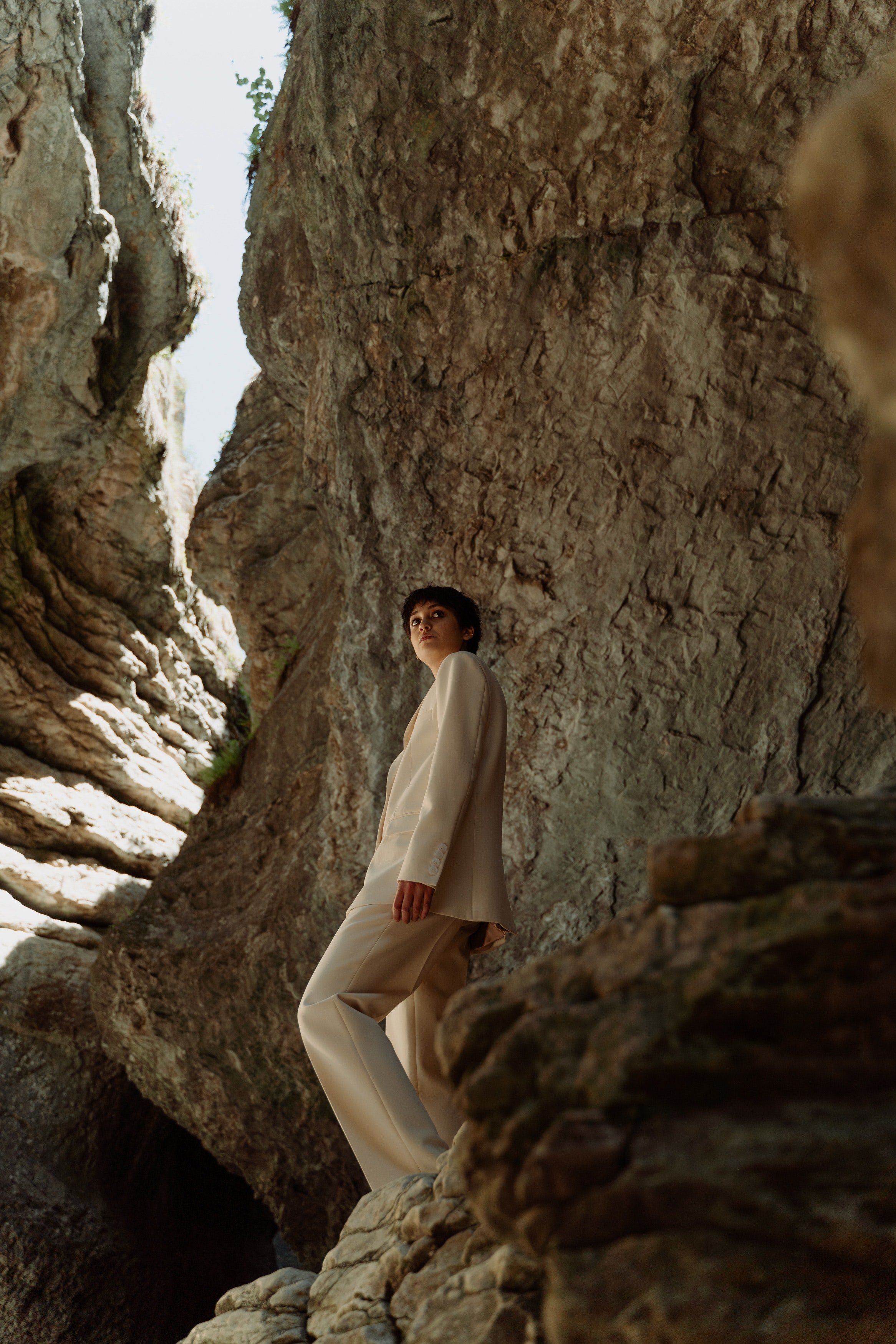
How’s your inspiration board feeling right now? Unfocused? Overwhelming? Before you let the chaos take over, know this: you’re exactly where you’re supposed to be! Think of it like a sculptor chiseling away at a block of stone to reveal the art underneath. You’re in the perfect place to start carving out your style.
This week we edit, “finishing” your visual inspiration board… for now. But remember that this process is ongoing. Style evolves, and so should your board. It’s a living, breathing reflection of your journey, so expect to revisit it as life changes.
Once you finish this step, take pride in your work and feel confident in the direction you're headed. Your inspiration board will guide you for the rest of this course, but it should never feel restrictive. Instead, defining and focusing your style should bring you a sense of freedom and ease as we move forward.
The Lesson
This week’s lesson is all about editing, and the key to self-editing is giving yourself time.
The benefit of having an external editor is a fresh perspective unencumbered by your own vision, able to see the unfiltered reality as it is. We want to replicate that experience for ourselves as best we can. Taking your time allows you to return to your work with fresh eyes, sharpening your ability to spot what to delete or explore further. That’s why we’ve dedicated a whole week to this process, as it might have felt rushed to try and build and edit all at once.
You might even find the process therapeutic. Deleting an image you thought reflected your style, but now feels wrong or constricting, should feel relieving. Adding new images that are edgier, more feminine, or less polished than you initially imagined should feel invigorating. If the process stops feeling therapeutic, it’s a sign it’s time to step back and take a break.
Editing tends to bring out a little neuroticism in even the most zen, meditation-loving people. If you find yourself obsessing over a single image, keep this in mind:
One image doesn’t make or break your inspiration board. In the words of Gen Z: it's not that deep.
We’re not in a hurry. Whenever you feel confined, take a step back and return later. This course will keep moving forward, but you can keep pruning longer if needed.
But naturally, this process will require you to make some tough decisions. Here are a few scenarios that may trigger frustration and how to handle them after taking your Indyx-mandated break:
Representing your multi-faceted style (and personality!) while staying cohesive
Fran Fine’s bold, sexy looks and Blair Waldorf’s polished, preppy style may both spark joy (they sure do for us!). But pulling off both without feeling like you have a split personality might be tricky. If you’re leaning more toward Blair’s style, ask yourself why exactly you’re drawn to those Fran images. Is it the color combo? The off-the-shoulder detail? The way she layers a textured shag coat over a monochromatic outfit? If you can pinpoint the specific element you love and want to incorporate into Blair’s base style, then keep the image.
On the other hand, if it’s more about Fran’s pose, her carefree personality, or your nostalgia for the character? In that case, it may be a better choice to edit it out. If there is an element you like but the image doesn't quite showcase it, consider finding a different image that more clearly shows the element you are drawn towards.
The opposite problem: desiring a visually pleasing, “aesthetic” board without capturing anything uniquely you
It’s also easy to fall into the trap of building a board that’s more about looking good than feeling right. Focusing too much on creating a “perfect” aesthetic can lead to a board full of beautiful images that don’t really reflect who you are.
We strongly advise against deleting images just because they don’t fit a particular aesthetic or the idealized version of the style you think you should have.
At the same time…when in doubt, we do recommend removing the image. Or, at least moving it to a secondary board to save for further consideration.To give you clarity, it is better to air on the side of a more tightly edited direction than to have too many images that you’re not 100% sure about.
The Homework
The homework for this week is to edit the inspiration board we began building last week.
You have so much great inspiration in front of you, and now it’s time to carve out what will serve you. There are no “right” or “wrong” images, just images that help you. But, here are a few steps you can follow to help you edit through your board.
Step 1: Editing Down
It’s time to take your virtual scissors out!
Round 1: Initial run through
A few images will likely stand out as out of place right away. Your style intuition - now sharpened through this process - has kicked in! These may be some of the first images you added, but now they feel off or simply not you. Let’s get those out of the way.
Round 2: (Re)consider your lifestyle
We said it last week, but it's worth repeating: make sure the visuals you’re collecting align with the lifestyle you actually live! Take a moment to ask yourself: would I realistically wear these outfits? Do they fit the activities I’m most often engaged in day-to-day? Don’t fall into the trap of creating a board solely for your fantasy self.
Round 3: Identify patterns and outliers
Once you’ve cleared out the low-hanging fruit, it’s time to prune the tree. But to do that, we need to have an idea of the shape we’re aiming for. Look for patterns in your images. Maybe you love faux fur trim or 60s-inspired boxy silhouettes. To help identify the outliers, consider grouping these patterns into temporary sub-boards. You don’t necessarily need to delete the outlier images, but this exercise helps identify the images you should revisit and understand more deeply what drew you to them in the first place.
Round 4: Refine the attitude of the images
While the lighting, filter, and pose may seem secondary to the clothes, they also help convey the overall attitude you want to project. Are you shy? Powerful? Bubbly? Do the images themselves reflect this?
Step 2: Editing Up
Editing isn’t just about cutting things out—it’s also about filling in the gaps and exploring interests that stand out from the initial patterns. This is your chance to bring your inspiration board together into a cohesive whole, creating one clear guiding vision.
Outliers: You might have noticed some outlier images that - instead of cutting out - you want to explore further. Or perhaps there are images you appreciated for certain elements, but the overall vibe doesn’t quite fit. This is the time to search for images that can fill in these gaps and complete your board.
Colors: Take a step back and see if a color palette is starting to emerge from your board. You’ll probably want to see about 5-7 dominant colors, unless you're going for a super monochromatic look á la Wednesday Addams. If you can spot the main colors, search for corresponding Pantone swatches and add them to your board. If your predominant colors aren’t immediately obvious, focus on the ones you love most and experiment by adding those swatches to the board to see how they affect the overall vibe. Color swatches can help unify your board and highlight areas where you might be lacking definition.
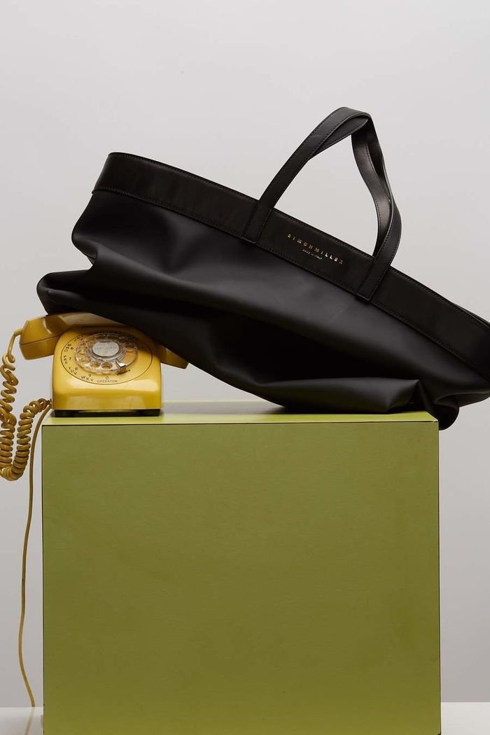
Designers and brands: While we’ve avoided branded content up until now, this is the moment to consciously consider them. After analyzing your board, you might notice certain designers or brands that align with your style. As you continue updating your board, these brands can serve as helpful sources of inspiration, offering modern takes on your style.
Step 3: Organizing
The final step is quite simple, but also a great test of the cohesiveness of your newly defined style. Up until this stage, we’ve been more “zoomed in” considering individual images. It’s time to “zoom out” and make sure that your board is speaking to you as a whole.
If you're using Pinterest, try the Shuffle option to randomly rearrange your images. No matter how many times you reshuffle your board, it should still convey the same united vision.
If you're using a different platform or prefer to organize it manually, take care that you have a balanced mix of visual elements distributed throughout. Your board should feel like one seamless whole rather than segmented parts glued together, which is why we recommend against partitioning it (at least at this stage!) into disparate sections like: “work” and “weekend”, “pants” and “dresses”, or even “summer” and “winter”.
And, share with your stylist!
Want to share your inspiration board with your Indyx stylist (current or future!)? In the app, go to Style > Resources > Style Preferences to tell us more about yourself including a spot at the end to drop the link to your board!
Don’t worry, you can always update this information later.
The Indyx Team’s Homework
If it’s helpful to visualize through examples, below is this week’s homework as completed by the Indyx Team.
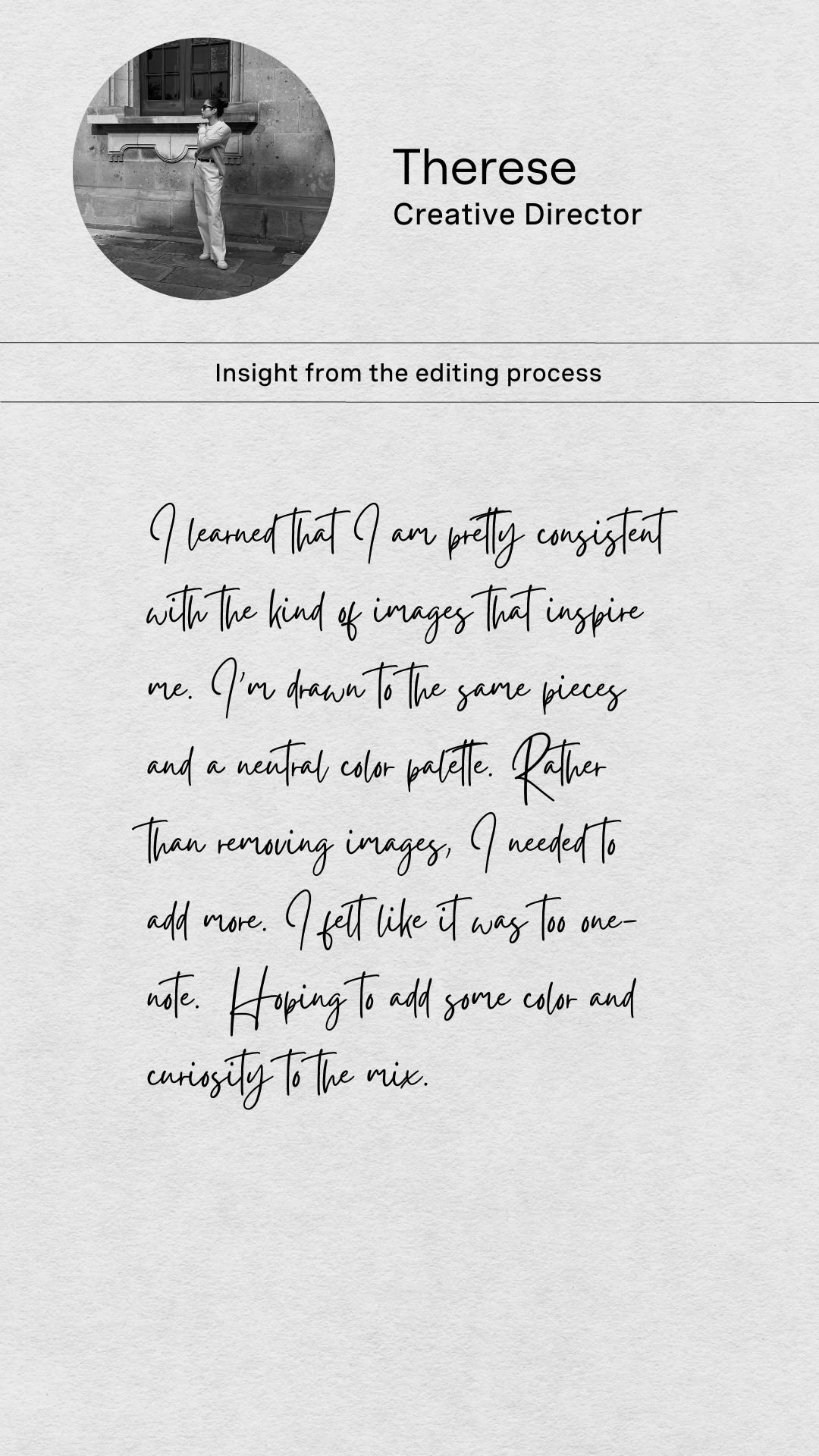
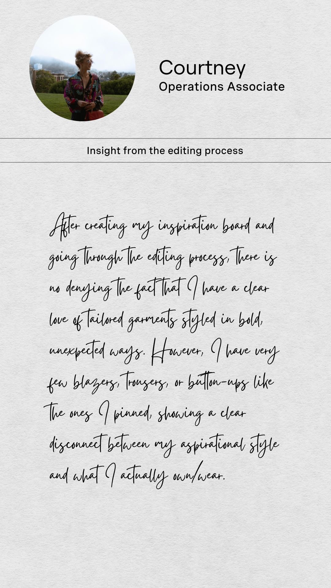
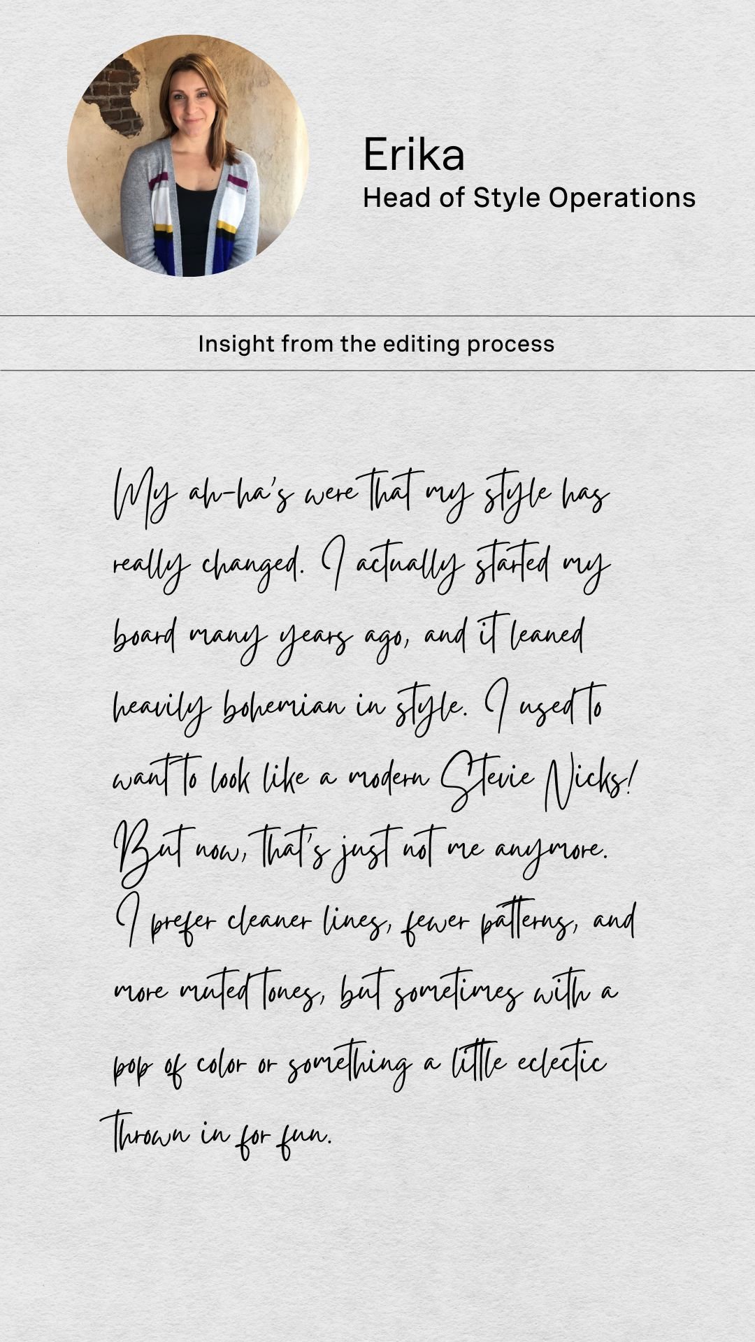
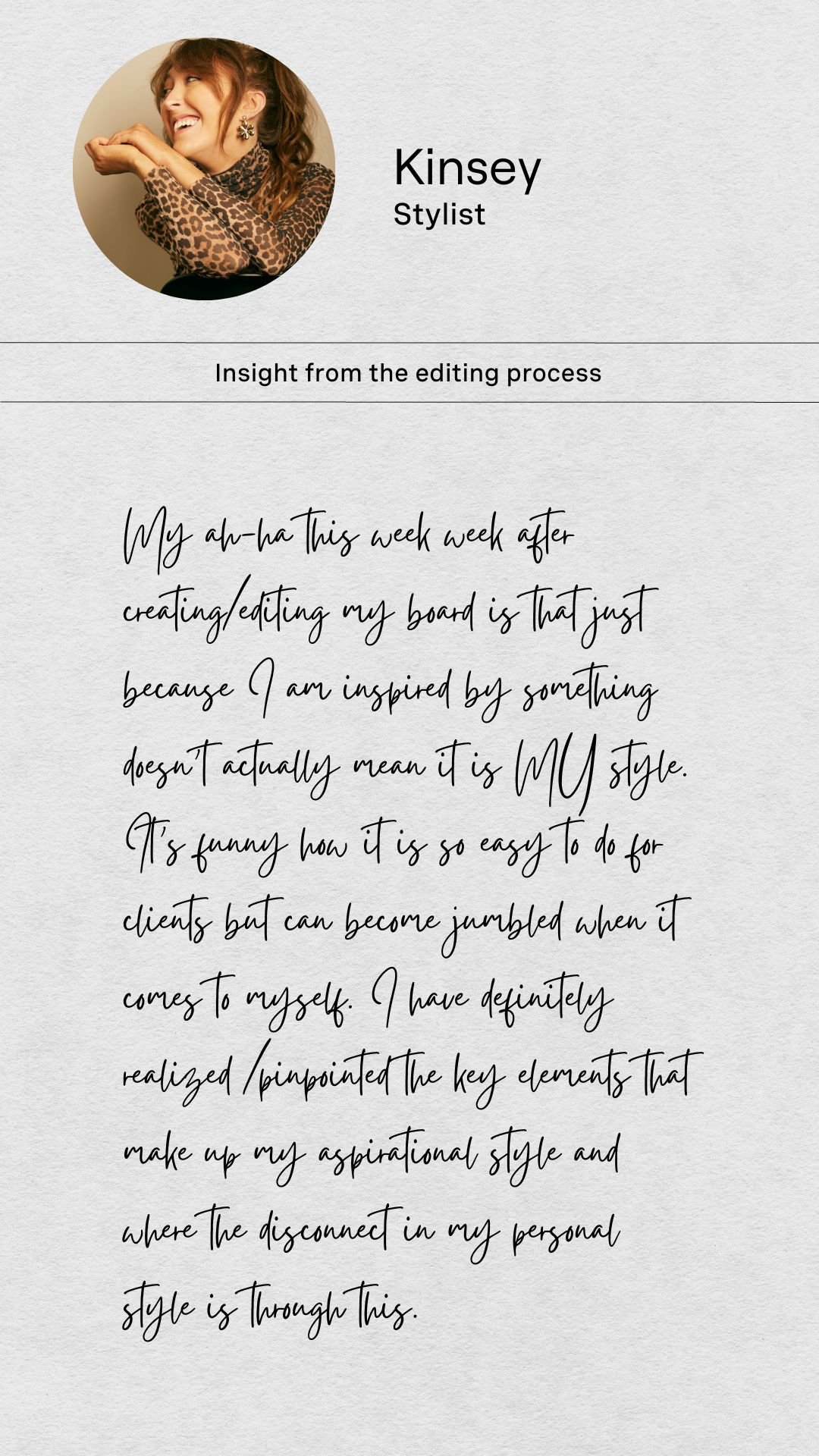
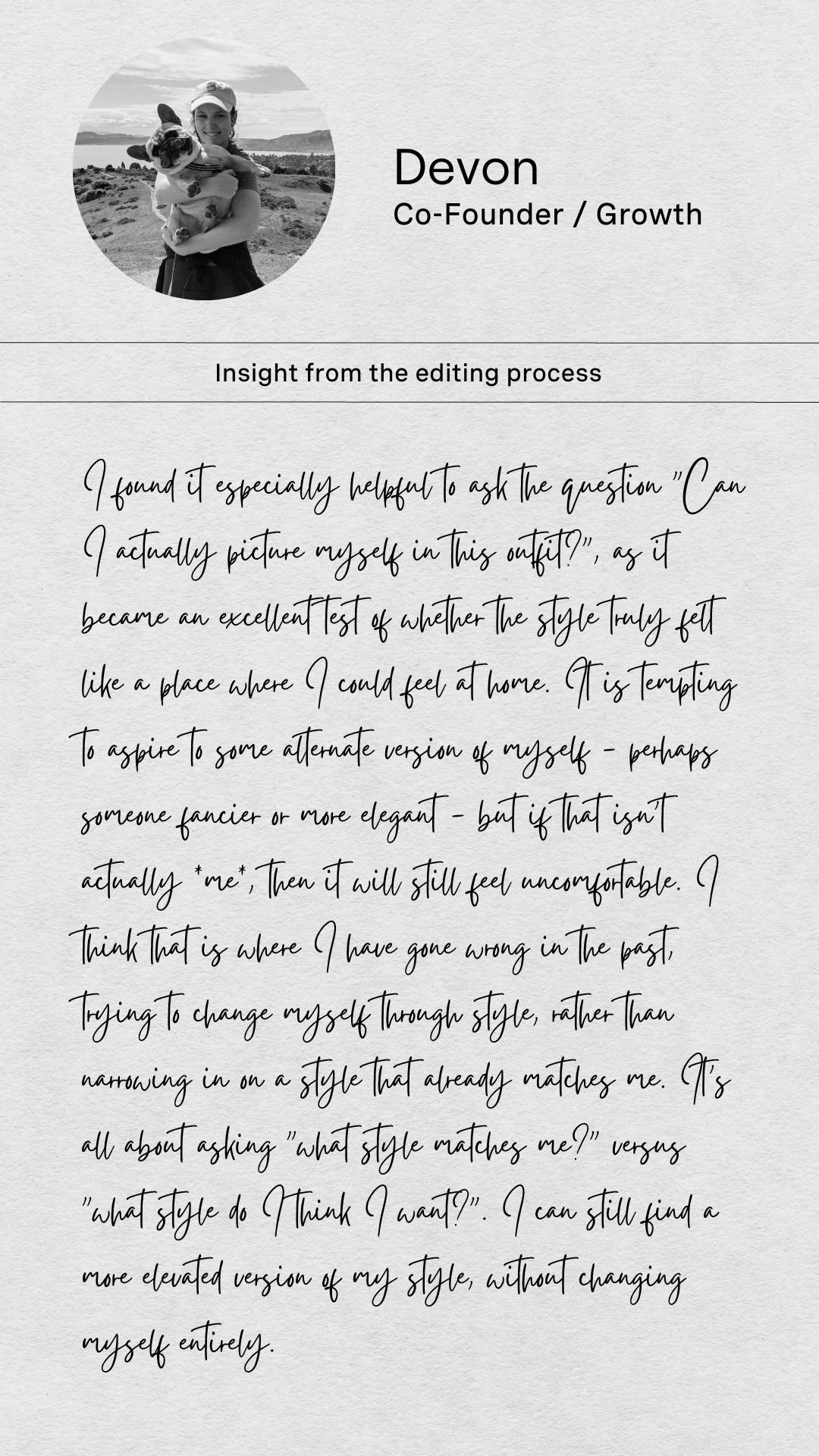
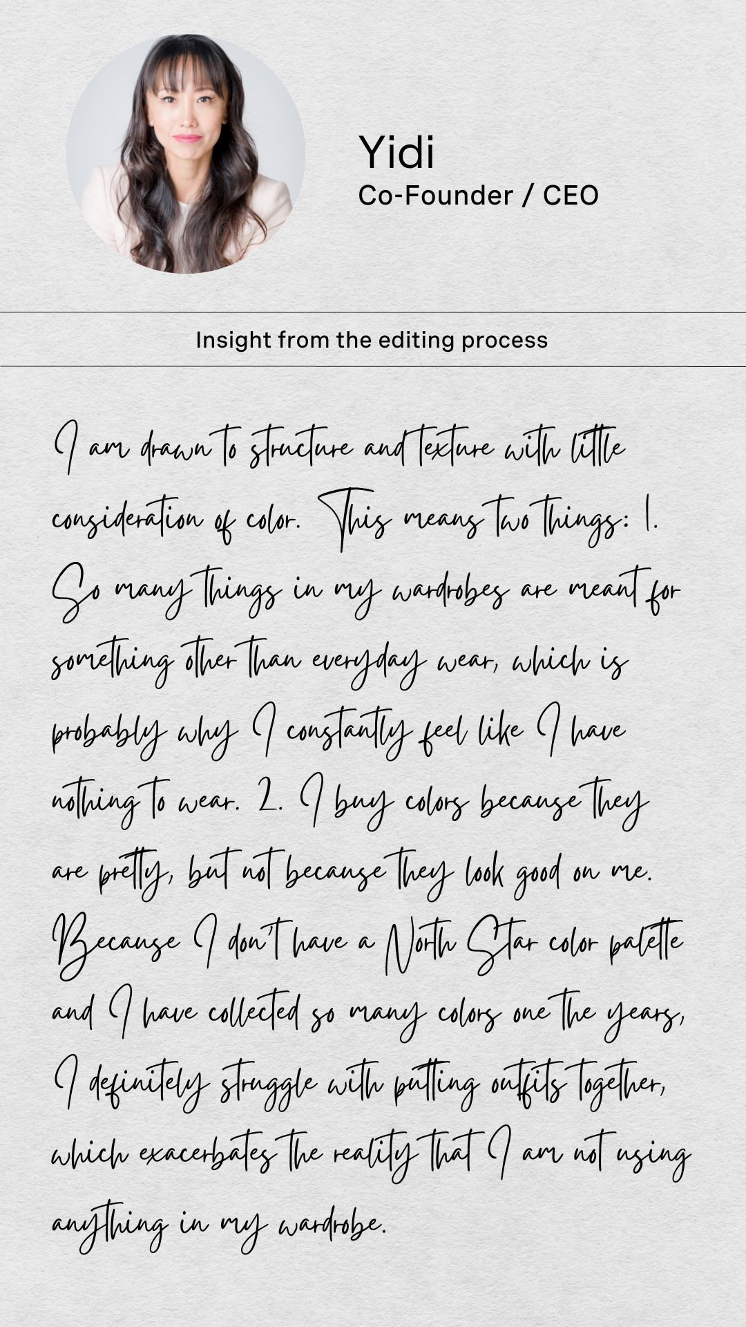
Courtney: https://www.pinterest.com/myindyx/courtneys-style-inspiration/
Therese: https://www.pinterest.com/myindyx/thereses-style-inspiration/
Erika: https://www.pinterest.com/myindyx/erikas-style-inspiration/
Devon: https://www.pinterest.com/myindyx/devons-style-inspiration/
Kinsey: https://www.pinterest.com/myindyx/kinseys-style-inspiration/
Yidi: https://www.pinterest.com/myindyx/yidis-style-inspiration/
Until next week…
Found yourself here without being signed up for the Style Workshop?
Obviously, we’re giving away this awesome content for free.
But, sign up for this experience in our app and you’ll get this 9-week course conveniently emailed to you at our recommended cadence to help keep you accountable.


